I had the fortunate opportunity to spend one month traveling Switzerland during the summer of 2016. During that time I was able to visit art and design exhibitions at the Kunstmuseum Luzern, the Museum Haus Konstruktiv Zürich, the Museum Gestaltung Zürich, and the Zürich University of the Arts, among others. I also had the wonderful opportunity to work for two plus weeks with Dafi Kühne at his studio 'BabyInkTwice' in Näfels as part of his Typographic Summer Program. I used the opportunity to brush up on my typographic and letterpress knowledge, experimented with materials and print techniques, and worked alongside a small group of graduate students from RMIT to create a series of fictiscious event posters.
My project 'Lumina' explored the phenomenon of light as installation art to engage local communities in a summer evening walk through a forest as a way to intice people out of Zürich and into the nearby smaller municipalities. The final print use produced entirely on a FAG (letterpress) proofing press using chipboard and various metal type. Setting the type was especially difficult and took several hours over the course of a few days. Being able to manipulate physical type, intended to go in perfect straight lines with perfect spacing, to become organic and playful, was not a simple task, but worth the learning experience and result.
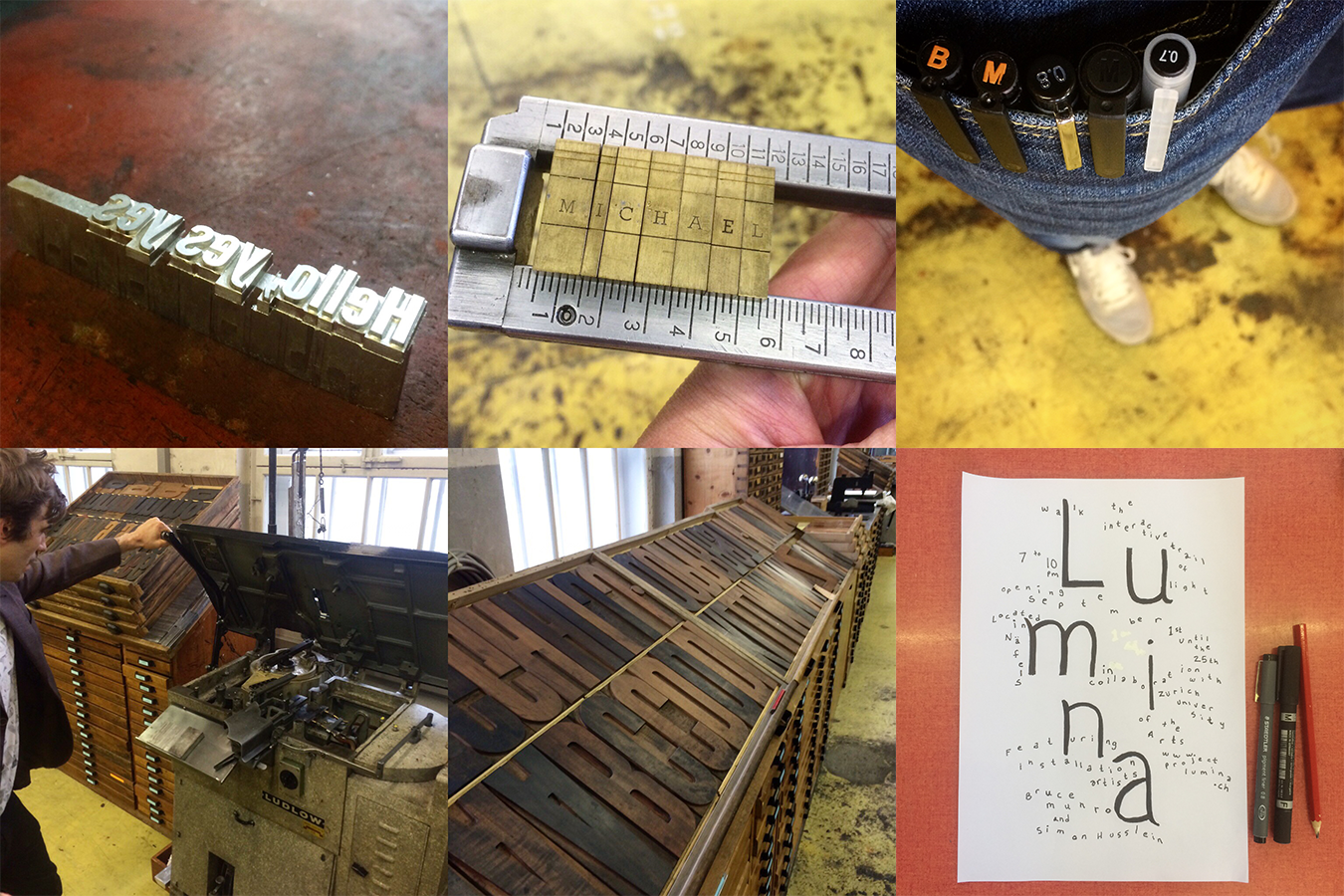
Getting to know the studio w/ Dafi Kühne, being able to use the ludlow typecasting machine was a great experience

physical kerning, using my home state as a reference point for tests

Raclette dinner party at the studio with the group and a trip to the Zürich design museum
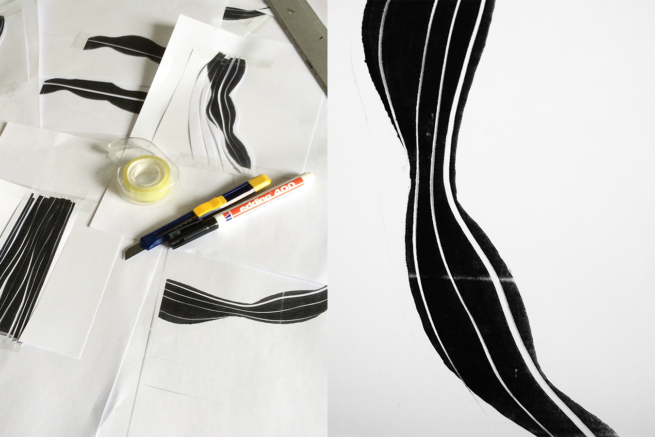
Organic line studies with sharpie markers and tape

print technique tests using string, tape, chipboard and paper
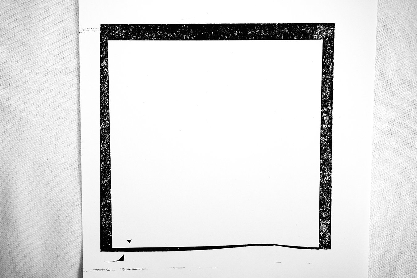
negative shapes
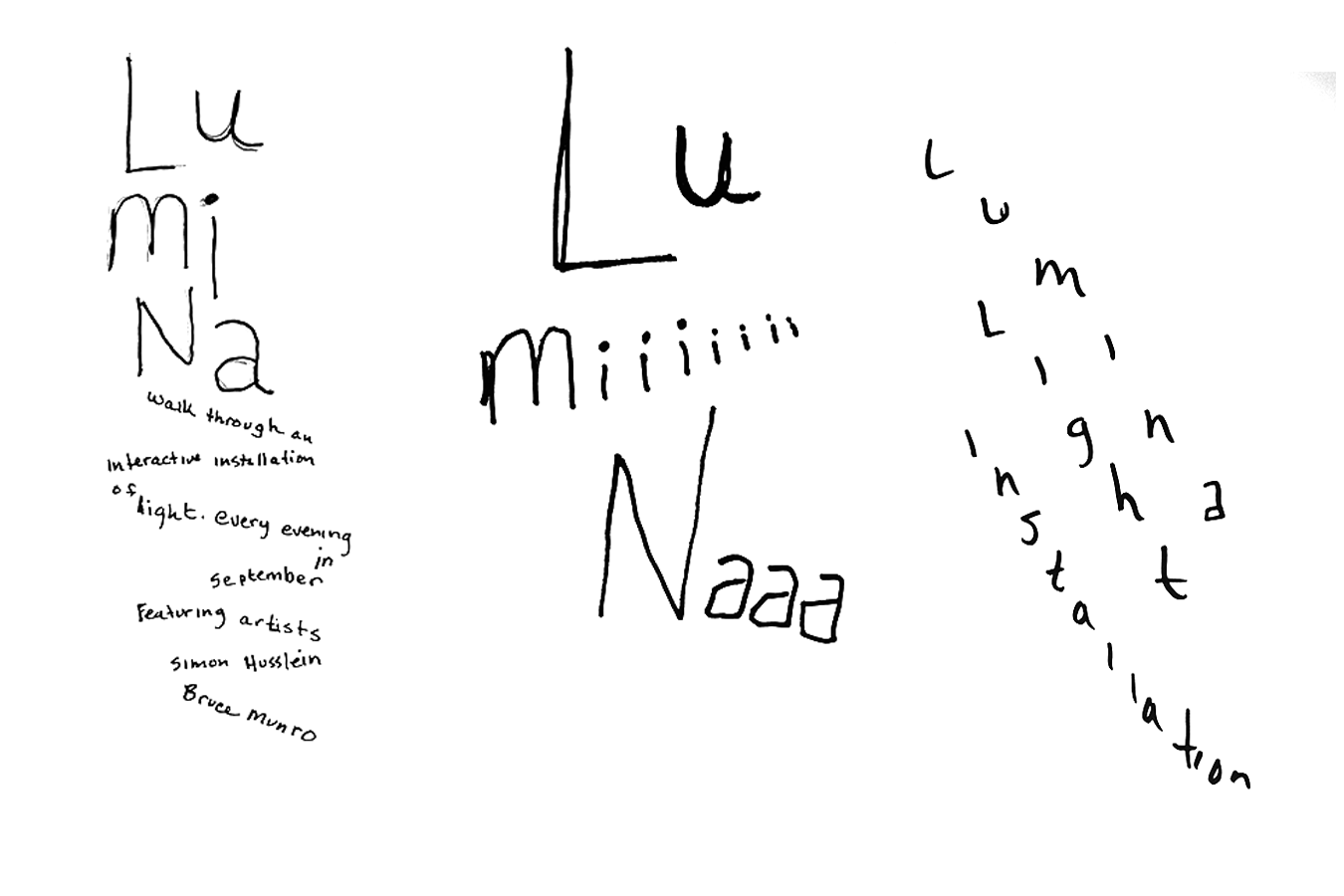
2 minute sketches for my poster concepts
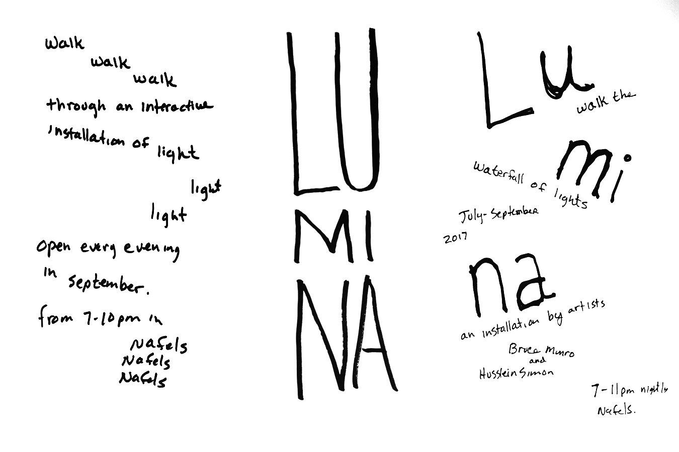
more poster sketches

a couple of my favorite concept sketches for the poster, next step, attempt to make this with physical type
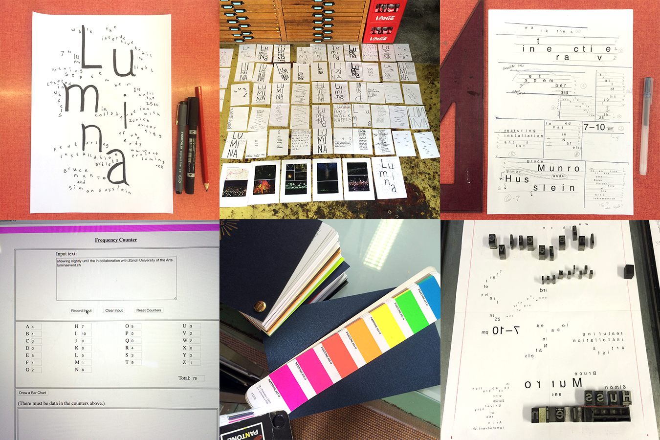
sketches, work plans, and color systems... also using a cool online tool to help count characters before typesetting

custom creating type out of chipboard with a utility knife
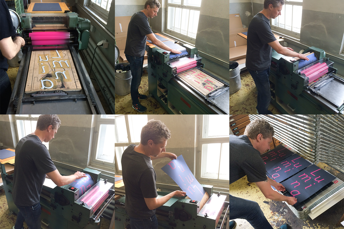
printing a custom mixed hot pink/magenta color on a glossy speckled blue paper, layer one

my 'typographic plan' next to the the metal type composition in progress

measuring and assessing the two layers and how they will work together

printer layer two, white ink on top of the pink type and blue paper... I never get to print white type, so I created an excuse to do it
